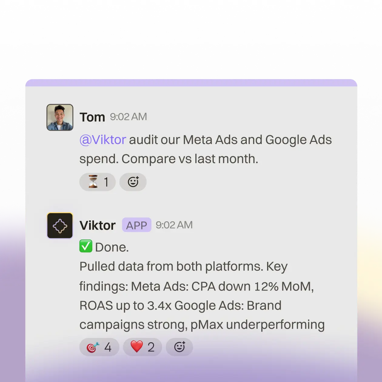
Brand Usage
Guidelines

Tone of Voice

Write like Viktor: direct, capable, and human. Not a chatbot. A coworker

What Viktor is

  • An AI coworker with its own computer. It lives in Slack, connects to your tools, and does real work
  • A persistent agent that remembers context, learns over time, and acts proactively
  • The most capable colleague on your team: research, reports, code, workflows, dashboards
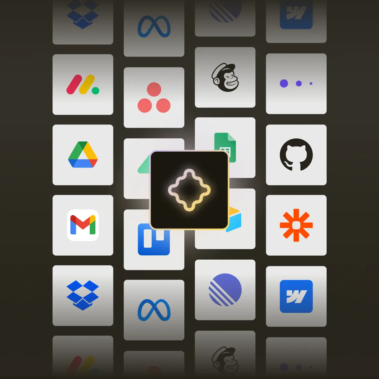
  • Built for teams. Connects to 3,000+ tools via browser and native APIs
  • Human-in-the-loop: Viktor proposes, the human decides

What Viktor is not

  • Not a chatbot. Viktor doesn't just answer questions. It actually does the work
  • Not a simple automation tool. It thinks, plans, and adapts with full reasoning
  • Not autonomous without oversight. Every significant action requires approval
  • Not a replacement for people. It augments your team's capabilities
  • Not "AI-powered X". Viktor is the coworker, not a feature inside something else

DOs and DON'Ts

DO

  • Always say Viktor. Do not say “the Viktor bot” or “the Viktor AI assistant.”
  • Emphasize that Viktor does real work, not only answers.
  • Position Viktor as a coworker. Use team language.
  • Mention Slack-first. Viktor lives where your team already works.
  • Highlight execution: code, browser, build, and deploy. Viktor is not chat-only.
  • Use concrete examples of what Viktor can do (research, reports, apps, automations).

Don't

Messaging

  • Do not call Viktor a chatbot, virtual assistant, or copilot.
  • Do not imply full autonomy. Always show where a human approves or reviews.
  • Do not position Viktor as ChatGPT or Claude in Slack. Viktor is a different category: an AI coworker wired into your tools and Slack.

Logo and color (official materials)

  • Do not use the logo on busy backgrounds without enough contrast.
  • Do not stretch, rotate, or change the logo proportions.
  • Do not use colors outside the brand palette for official materials.

Icon

The Viktor icon is a connected 4-pointed star shape representing interconnection and intelligence. It uses a lavender-to-gold gradient that defines the brand.

Download all icons
icondark
iconlight
iconflat

Colours

Viktor's palette is warm and grounded. Dark backgrounds with cream text, accented by lavender and gold.

soliddark-1
#262219
soliddark-2
#342E23
soliddark-3
#3D3A32
solidlight-1
#F5F3F0
solidlight-2
#F5F3F080%
solidlight-3
#F5F3F040%
solidaccent-pink
#D1C2F4
solidaccent-yellow
#FFF4CC
gradientversion-1
#262219#D1C2F4#FFE999#F5F3F0
gradientversion-2
#D1C2F4#FFE999#F5F3F0

Typography

Font styles, weights, and how to apply Viktor's typography in design.

Satoshi

RegularMediumBold

Graphics

A set of branded graphics designed to mimic real conversations inside tools like Slack, recreating the context in which Viktor operates. Threaded messages, commands, and outputs happen directly in chat. Graphics featuring external tool logos highlight Viktor's integrations and its ability to execute work across systems.

Light mode messages
Integrations
Dark mode messages